At-A-Glance
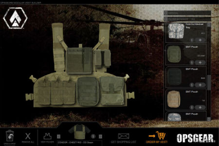
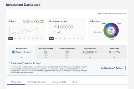
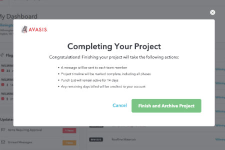
UX / UI Design
15 years of experience in research, ideation, design, testing and development in a people-centered, iterative product design approach
Visual Design
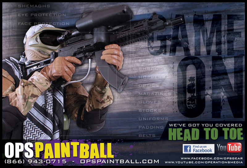
Experience in bringing brands and products to life through design systems, web banners, print ads and brochures, convention banners, and more
Accessibility
Helping make sites and products accessible for all, following WCAG standards and Section 508 guidelines
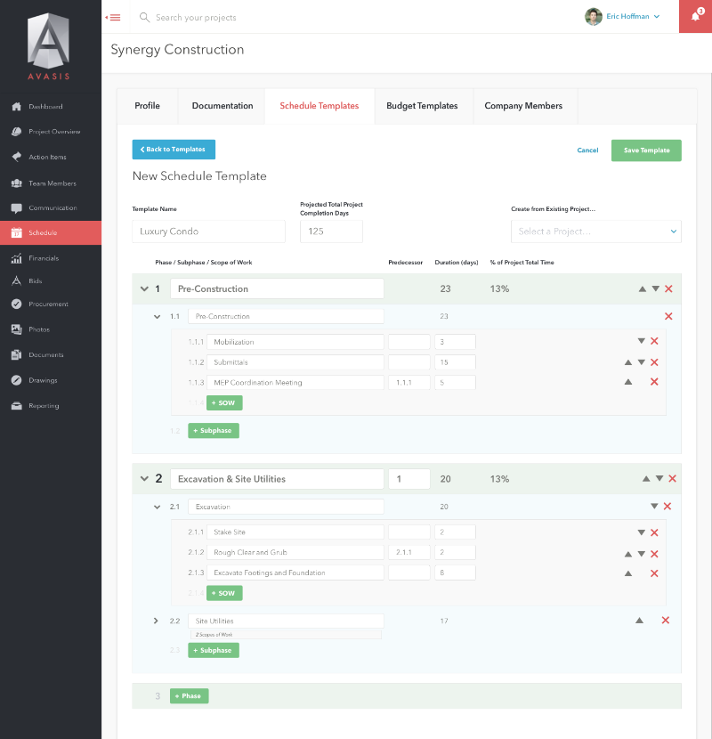
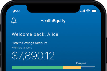
Mobile App Design
Experienced in planning, designing, and testing mobile-optimized products
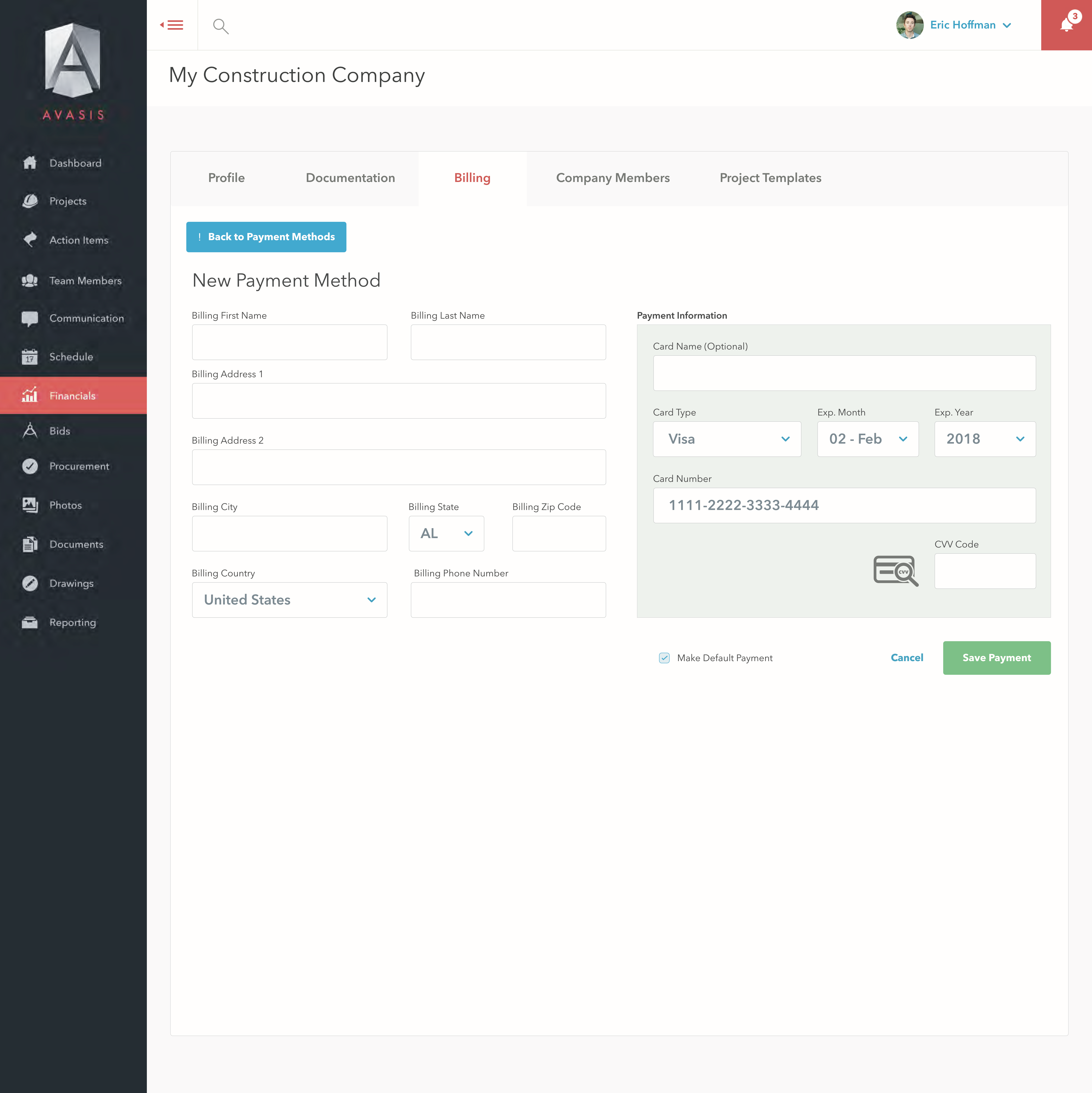
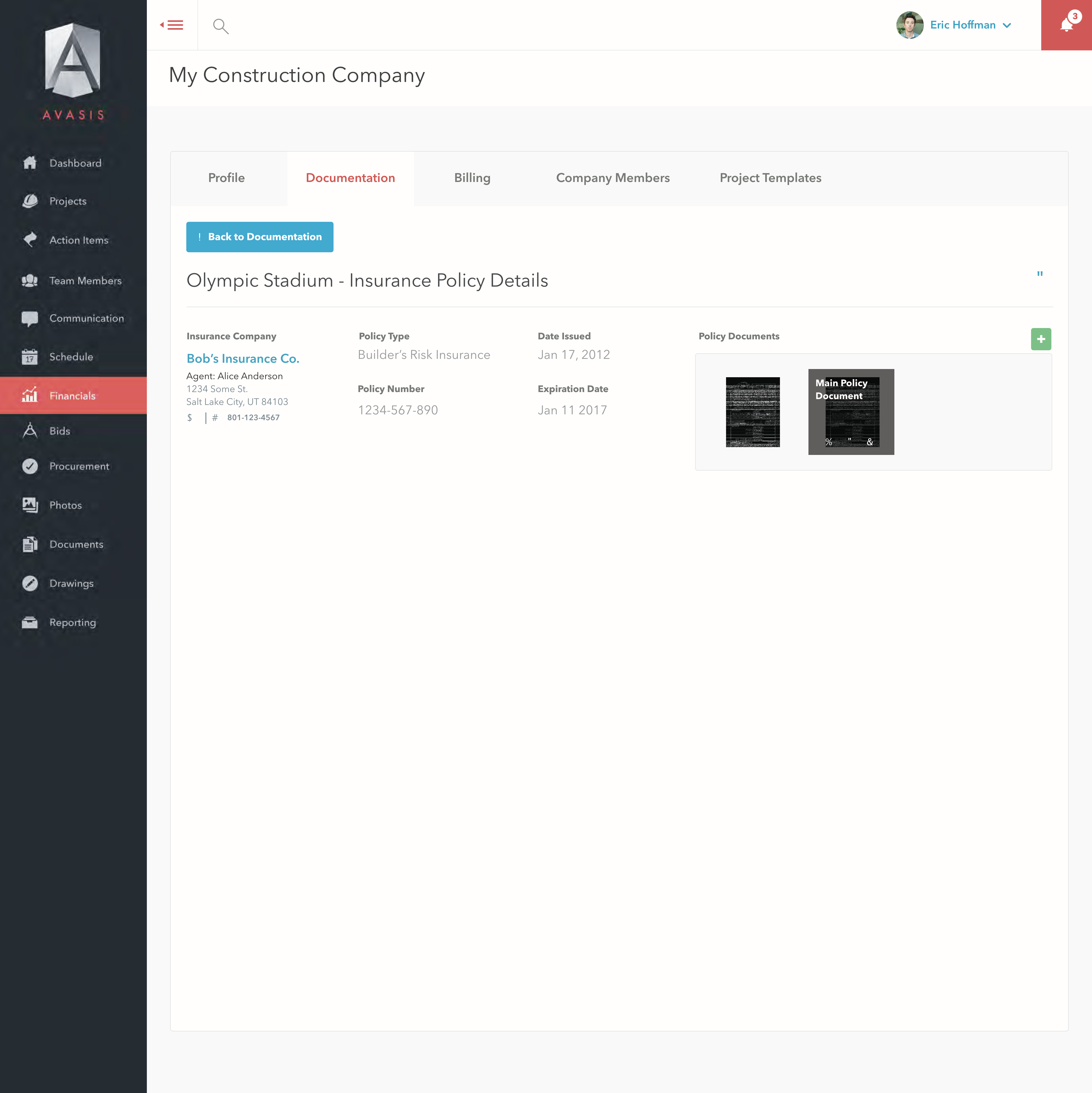
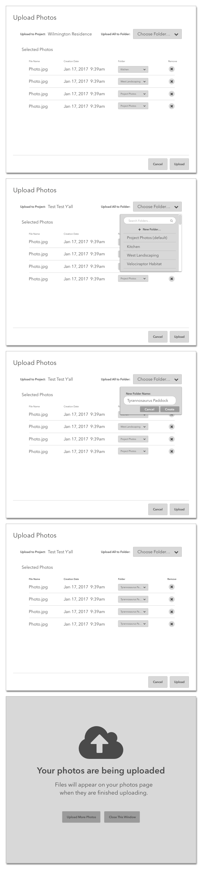
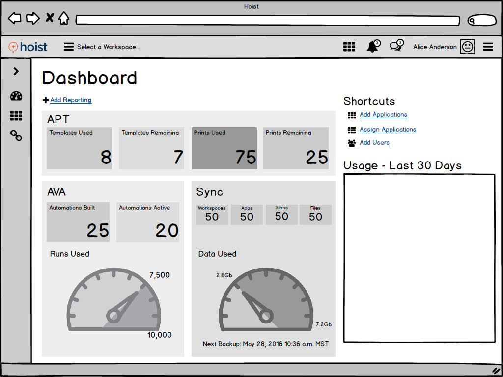
Portfolio
Selected UX Case Studies

UX / UI Design Samples

Selected Visual Design Samples
Email Campaigns and Banner Ads
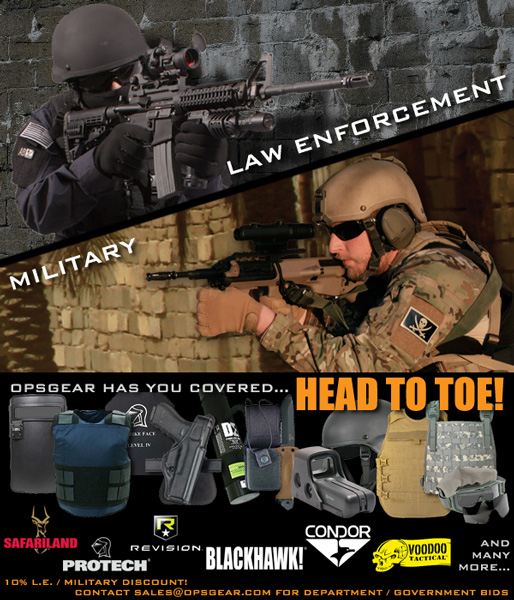
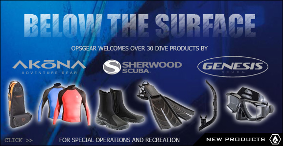


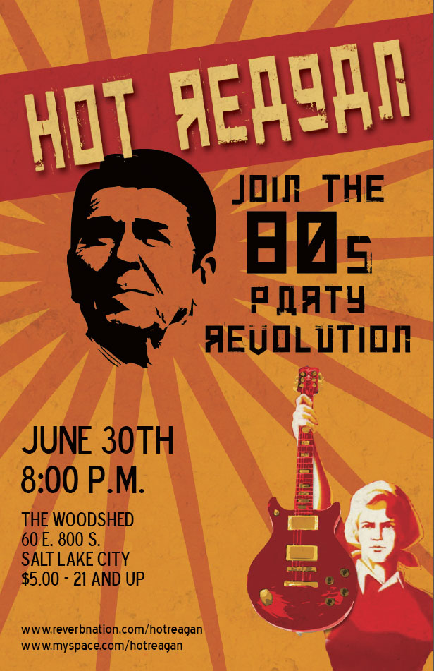
Print Design
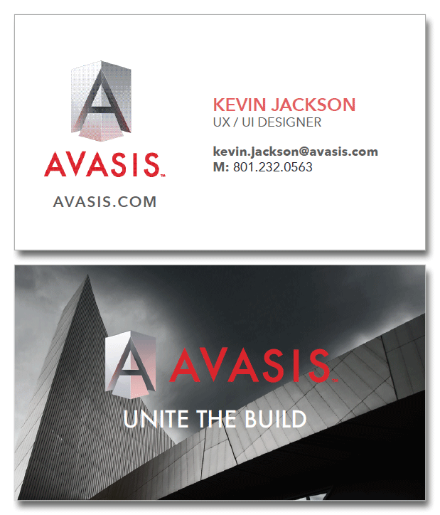


About Me
Hi, I'm Kevin.
I've been working in UX and visual design for over 20 years, and I've had the awesome opportunity to help build products and connect them with the humans that use them.
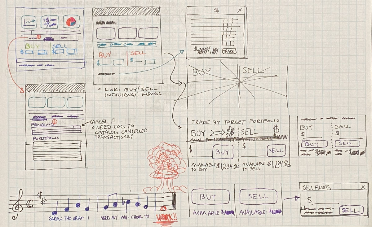
In pursuit of my passion for media and design, I once helped film a training exercise with the U.S. Army inside a simulated alleyway. My job during production was to dress up like an enemy and pretend to make explosives, which ended in my being shot by multiple paintball rounds from several directions. It hurt.
In my spare time I write music, some of which might make it onto TV, films, or video games, some of which is almost danceable. I'm a terrible surfer and snowboarder, but do both as often as occasion allows.
I currently live in the greater Salt Lake City area with my wife, two adorable kids, and a somewhat less-than-adorable mix of Corgis, birds, and ducks.
Download my resume. (opens PDF document)